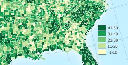
Choropleths are thematic maps shaded or patterned in proportion to the measurement of the statistical variable being displayed on the map, such as population density or per-capita-income.
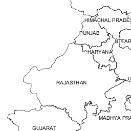
This post is about creating quick choropleth maps in R, with macroeconomic data across geographies.
As a sample exercise, I decided to get data on what percentage of their aggregate disbursements, do states in India spend on development expenditure. I got the data from the Reserve Bank of India’s website. I had to clean the data a little for easy handling in R. Here’s the cleaned data.
I used the choroplethr package designed by Ari Lamstein and Brian P Johnson to animate the data on the map of India. Here’s my code followed by output maps.
| ## load the requisite libraries into R | |
| library("xlsx") | |
| library("choroplethr") | |
| library("choroplethrAdmin1") | |
| library("ggplot2") | |
| indianregions <- get_admin1_regions("india") | |
| ## gets dataframe of 2 columns with name of country ("india") throughout column 1 | |
| ## and name of regions in 2nd column | |
| nrow(indianregions) | |
| ## counts the number of regions under country "india" | |
| setwd("C:/Anirudh/Coding/R/Practice/Practice Iteration 2") | |
| df_dev_indicators <- read.xlsx("statewise_development_indicators.xls", sheetIndex = 1, colIndex = 2:5, rowIndex = 2:31, header = FALSE) | |
| ## reads excel data into an R dataframe | |
| df_dev_indicators_2012 <- df_dev_indicators[c(1,2)] | |
| df_dev_indicators_2013 <- df_dev_indicators[c(1,3)] | |
| df_dev_indicators_2014 <- df_dev_indicators[c(1,4)] | |
| ## create 3 separate dataframes from the parent dataframe so as to have 2 columns, | |
| ## column 1 for region and column 2 for column 2 for value metric | |
| names(df_dev_indicators_2012) <- c("region","value") | |
| names(df_dev_indicators_2013) <- c("region","value") | |
| names(df_dev_indicators_2014) <- c("region","value") | |
| ## assigning column names [required as per choroplethr function] | |
| admin1_choropleth("india", df_dev_indicators_2012, title = "% Expenditure on Development in 2012", legend = "", buckets = 9, zoom = NULL) | |
| ## prints the choropleth map for 2012 indicators | |
| southern_states <- c("state of karnataka","state of andhra pradesh", "state of kerala", "state of tamil nadu", "state of goa") | |
| ## stores regions that are to be printed as a bucket map | |
| admin1_choropleth("india", df_dev_indicators_2012, title = "% Expenditure on Development in Southern States in 2012", legend = "", buckets = 9, zoom = southern_states) | |
| ## zooms into the buckets specified earlier | |
| ## — CONTINUOUS SCALE — | |
| admin1_choropleth("india", df_dev_indicators_2012, title = "% Expenditure on Development in 2012", legend = "", buckets = 1, zoom = NULL) | |
| admin1_choropleth("india", df_dev_indicators_2013, title = "% Expenditure on Development in 2013", legend = "", buckets = 1, zoom = NULL) | |
| admin1_choropleth("india", df_dev_indicators_2014, title = "% Expenditure on Development in 2014", legend = "", buckets = 1, zoom = NULL) |
…and as expected, the lines of code above print out the desired map

In the examples above I set the buckets attribute equal to 9. That set the data in discrete scales. Had I set buckets = 1 instead, we would have got a continuous scale of data.

The same for the last 2 fiscal years:

For the US, there are amazing packages for county level and ZIP code level detail of data visualization.
Here’s more on the choroplethr package for R and creating your own maps.


 Anirudh Jayaraman
Leave a comment